What is the most shocking thing about Hobart’s Museum of Old and New Art?
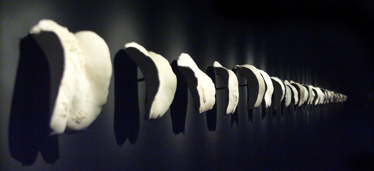
David Walsh’s extraordinary new museum has received its fair share of media coverage since being opened a year ago. This often focused on its cost ($75 million of Walsh’s own money) or the ‘scandalous’ nature of some exhibits, such as Greg Taylor’s Cunts: A Conversation pictured above (controversy which the museum seems to delight in). More eruditely, there has been furious debate about whether the collection is simply a rich man’s Cabinet of Curiosities or whether it truly ‘helps us to lead better lives’ (the quaint, almost Stalinist view of the civic function of art argued by philosopher, John Armstrong in Island magazine).
MONA is an exhilarating place to visit. There are any number of reasons for this. The dramatic buildings and site. The eclectic, unblinking nature of the opening exhibition on sex and death: ‘Monanism’. The fact that one can freely take photographs. The irreverent comments by Walsh himself about some of the exhibits. And not forgetting the bar in the basement …
But what shocked me most was the difference made by the absence of any labels or directions whatsoever about how to view the exhibits. Our initial encounter with each artwork is totally unmediated by contextual ‘noise’. Not even the barest detail.
In other galleries, we can ignore the patronising ‘explications’ often displayed next to art works, but cannot help checking the title, the artist, the date. Yet even these interfere with our experience of the work, filtering what the eye sees through everything we may happen to know know about Rothko, about the development of perspective drawing, or Caravaggio’s tempestuous life.
Is that painted carven head from an Egyptian tomb? An anatomical model from the Renaissance? Or a new piece by Damien Hirst? Even the artist’s name or a date mediates how we perceive a work, instead of leaving the individual’s eye to see and sensibility to react.
All you could want to know about any work at MONA is on hand by checking the iPod guide, but this becomes a secondary and optional act to seeing itself. This naked, exhilarating encounter with the artworks at MONA is the museum’s most shocking revelation for the visitor – one which which will long outlast any philistine outrage over the poignant line of pudenda in Taylor’s ‘conversation piece.’


I had my first visit to MONA this year. Unlike when you with air, visitors are now given small iPhones which have information about the exhibits. I don’t like them for exactly the reasons you expressed in your post. The interesting thing is that the museum was full of people looking for iPhones rather than looking works on the walls. Curious.